
Welcome to HelpCenter Live!
 We are the leading open source Live Chat application, dedicated to provided top quality support products to help you meet your chat and support demands.
Having Trouble To Get It Work?
What is Help Center Live?
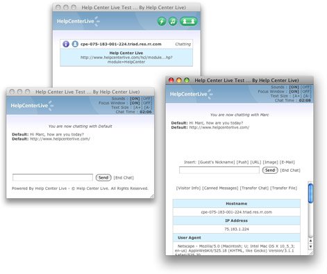
 Help Center Live is an open-source, community driven live chat & support system. You may easily provide live support on your website just like large companies do with very little work. With Help Center Live, you can provide a real-time, live support or sales person experience.
Help Center Live in Fantastico
HCL Pre-installation Instructions
 Make sure you have PHP 4.3.2 or greater installed
- Make sure you have MySQL 1.3 or greater installed
- Make sure you have created a database for HCL(note database name, user name, and password)
Subscribe to our Newsletter